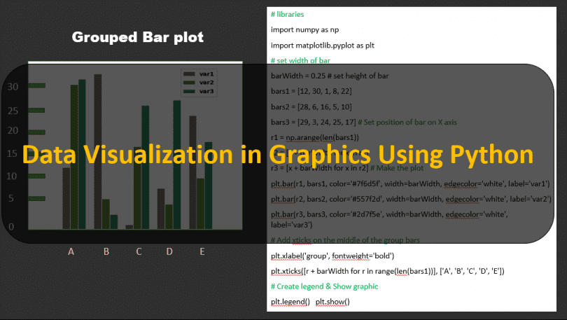
In This tutorial You will learn about Graphs , How to plot a Graphs , Bar-chart, Box Plot , Venn Diagram , Area Chart , world cloud , Histogram Scatter plot in Python we have Develop lots of Graphs with the help of Python for you and sharing Source code with you Guys.
You Guys can download 150 Data Visualisation Graphics Using Python
Basic Bar Plot
Bar Plot is very common type of Graphs it use to Show Data with relationship like if we want to show Height and weight.
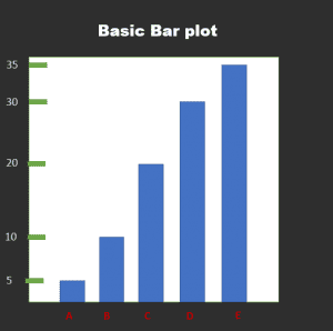
Code
import numpy as np
import matplotlib.pyplot as plt

>> Make a Your own Required dataset:
height = [5, 10, 20, 30, 35]
bars = ('A', 'B', 'C', 'D', 'E')
y_pos = np.arange(len(bars))

>> Create bars
plt.bar(y_pos, height)

>> Create names on the x-axis
plt.xticks(y_pos, bars)

>> Show graphic
plt.show()
|
Area Plot Chart In Python
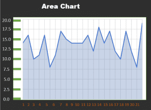
Code of Area chart in python
# libraries
import numpy as np
import seaborn as sns
import matplotlib.pyplot as plt
sns.set_style("whitegrid")

# Color palette
blue, = sns.color_palette("muted", 1)

# Create data
x = np.arange(23)
y = np.random.randint(8, 20, 23)

# Make the plot
fig, ax = plt.subplots()
ax.plot(x, y, color=blue, lw=3)
ax.fill_between(x, 0, y, alpha=.3)
ax.set(xlim=(0, len(x) - 1), ylim=(0, None), xticks=x)
|
Grouped Bar-plots in Python
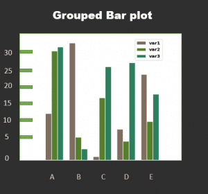
Code of Grouped bar Plot in python
# libraries import numpy as np import matplotlib.pyplot as plt # set width of bar barWidth = 0.25 # set height of bar bars1 = [12, 30, 1, 8, 22] bars2 = [28, 6, 16, 5, 10] bars3 = [29, 3, 24, 25, 17] # Set position of bar on X axis r1 = np.arange(len(bars1)) r2 = [x + barWidth for x in r1] r3 = [x + barWidth for x in r2] # Make the plot plt.bar(r1, bars1, color='#7f6d5f', |
Basic Venn Diagram with two groups
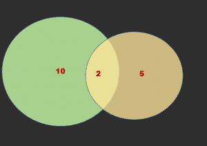
Code of Basic Venn Diagram with 2 Groups in python
# library
import matplotlib.pyplot as plt
from matplotlib_venn import venn2

# First way to call the 2 group Venn diagram:
venn2(subsets = (10, 5, 2), set_labels = ('Group A', 'Group B'))
plt.show()

# Second way
venn2([set(['A', 'B', 'C', 'D']), set(['D', 'E', 'F'])])
plt.show()
|
You Guys can download 150 Data Visualisation Graphics Using Python

